The prototype
With a few bits taken from everyone's concepts we put together our first prototype. The first prototype was a proof of concept to see how users would react to simplifying curator down to one UI.
In the top left we can see the feed options where a user can change which of their feeds they are working on. From this menu a user can then navigate to the settings for the post rules and custom design settings.
In the main work area a user can filter through connected social media platforms as well as curate the posts that have been collected from those platforms.
In the top right hand corner we have the share, preview and publish pages easily accessible for a user.
From this a user can access all the frequently used tools from the one interface.

Feedback
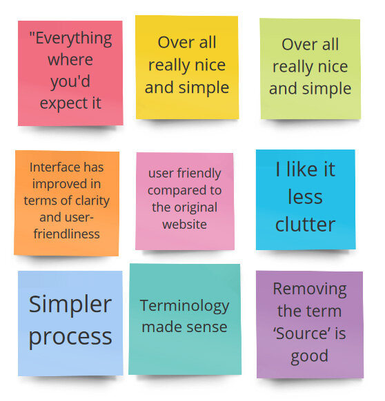
We conducted usability testing on this prototype through Zoom. Our objective was to see if we had made the UI more intuitive with a series of tasks for users to complete.
The results were extremely positive. Users were able to easily navigate through tasks and no longer felt lost in the process. With the technical terminology removed, the cognitive burden on the user was reduced.
We did however come across two issues that I have addressed in my hi-fidelity prototype. The first issue was confusion between a user's curator feed which they would embed on the website, and the feeds from the social media platforms that had connected to their account.
The second one was the use of icons: If there was a chance for an icon to be misinterpreted it would happen. This was very evident when accessing the feed settings.
Presenting to the client
Initially we were dealing with one point of contact who was very keen to make changes at Curator.io. We had multiple stand-ups with the client throughout the project on top of the initial kick off meeting, and a mid project show and tell.
When I conducted the final presentation we were surprised by the CEO/Founder being present. Unfortunately, coming in at the back-end of the project he was missing some context, and was also understandably protective of what he had created.
There were a few cases which he argued hard against what we presented; however I was able to make valid arguments using the research data from the initial usability and prototype testing to allow him to empathise with users.
This particular experience was extremely valuable and reinforced to me why I need to continuously champion the needs of the end user.
Curator.io was originally built around technical features and functionality and did not consider the end user. I was able to demonstrate to this stakeholder that users did not understand how to interact with this overly technical product, and was in need of a more simplified design to address the churn rate.
Curator.io informed us that they would be pushing our changes live within a month or two and will pass on how it performs so watch this space!
