MFK Design
MFK Design
Michael Ferguson-Kang - UX designer
portfolio_mockup_fli[.jpg

On The Road Cycle Coaching

Applied skillsets: Holistic business re-design | UX Designer | UX research | Social media strategy

On The Road Cycle Coaching lacked a strong online presence which was impacting the business’ ability to attract new athletes.

With valuable feedback from existing athletes, I went further than a website and produced a holistic business re-design.

 
otr_logo_v02.jpg

The client

When I first sat down with Matt from On The Road it became clear he lacked the motivation and skills to optimise key touchpoints for his business.

When it came to his social media presence, in particular, Matt didn’t know what sort of content was relevant and appealing to his athletes. Every time he tried to motivate himself to post or create anything he was overwhelmed by his uncertainty. This would increase the perception of effort and he would soon lose any drive to continue.

To quote:

“I don’t want to write contrived stuff on Instagram … but even if I wanted to, I wouldn’t know what to write”.

Matt needed to be shown the power of an orchestrated online presence. I looked specifically at his website and Instagram account, as well as redesigning branding guidelines and the On The Road logo.


The research plan

Matt wanted to target the same type of athlete and expand his existing client base. As such, I based my research plan around his current client’s perceptions of the group.

I conducted six interviews:

  • Four clients of the group across different levels of fitness, age, and gender.

  • One former client of the group.

  • One client who had also previously been part of a competitor coaching company.

The research plan focussed on distilling key perceptions of On the Road: 

  • Why did they choose On The Road?

  • What expectations do they have when landing on a coaching service website? 

  • What information would be needed at different points in the client conversion funnel (awareness through to sign-up)?

  • What did they think of the current On The Road web presence?

  • What kind of websites & social media accounts did they get value from and why?

energx_research.png

How might we

how might we help On The Road understand how to communicate to potential customers across their key touchpoints.

How might we better align the On The Road branding to their services.

How might we help On The Road create opportunities from the problems that the current On The Road clients face.

CURATOR.IO (Copy) (Copy)
otr_website_old.jpg

The previous website

The previous website suffered from a lack of direction. The content had been added in over time with no thought to information architecture. However, the key issues were:

  • A number of On The Roads services were not listed.

  • Navigating the website was not easy nor intuitive.


Instagram

Instagram and, to a lesser extent, Facebook themed as more important to his clients than Matt realised.

  • Multiple interviewees listed Instagram as the first platform they check when looking at a business or service.

  • The On The Road Instagram account hadn’t been updated in so long that it was perceived as a business on the decline or even closed.

  • On The Road’s Instagram account looked more like a personal account than a business account.

otr_research_instagram.jpg

OTR_research_inclusive.jpg

Inclusive

On The Road’s success with several elite athletes, while demonstrating a superior service, also gave the perception that the group was too elite for the average rider. This perception was a significant barrier to some clients and was only dispelled once they did a trial with the group.

Therefore, it was going to be important to bring the true characteristics of the group to the forefront of the website: inclusive, friendly, family-like, camaraderie, for my level.


Motivation

Two themes managed to tie in together as both a problem and a solution.

Due to COVID-19, cycling events were being canceled. This impacted people's motivation and created doubt as to why they were training.

When probing interviewees on what they felt On The Road did well, a common theme was the group challenges that they used to run.

By starting up group challenges again, On The Road could leverage it as a way to raise people’s motivation in lieu of events.

otr_cancelled.jpg

otr_feedback.jpg

Coaching feedback

Wanting to receive formal feedback on training progression was a common theme but had not been a service of On The Road. Coaching feedback had the opportunity to create a real one-on-one connection between Matt and his clients; an important factor when it came to athlete retention.

The group training is based around bootcamp style training. Turn up, do the workouts and go on with your day. Given the pricing and time commitment, constant coaching feedback wasn’t feasible.

The solution was to provide a report card every six months. This was an achievable amount of time for athletes to see improvements and an achievable amount of time for Matt to deliver on for all the members of the group.


Actionables

I presented all my findings to Matt in the format of the current situation, the why, and the opportunity that could be seized upon.

From the research I conducted, Matt immediately actioned the following:

  • Guidelines for his social media posts. This was met with an all-time high in his social media interactions within three posts!

  • A six-monthly report card for clients to address their concerns about the lack of feedback.

  • The re-start of challenges within the group to raise the motivation lost due to cancelled events.

Guidelines that Matt can quickly access when struggling with social media posts.

Guidelines that Matt can quickly access when struggling with social media posts.

OTR_LOGO_V01_white.png
CURATOR.IO (Copy) (Copy) (Copy)
The previous On The Road logo.

The previous On The Road logo.

Branding

The On The Road branding was something that needed addressing for a number of reasons.

The original logo lacked legibility. The logo was often viewed on a cyclist whizzing by so it was going to be essential that it could be read easily.

The logo also lacked context. There had been confusion with people inquiring about Athletes wearing the kit on On The Road being a club and not a coaching service. The addition of “Cycle Coaching” to the branding was essential.


But does it fit?

Based on a mood board with logos from the most prominent cycling brands it became clear that the script typeface didn’t work.

While the script typeface was something that could work for a cafe or craft brewery it was clear that a sans serif typeface would be needed to fit within the cycling world and address the issue of legibility.

logo_board.png

logo_designProcess.png

Design iteration

The iterations of the logo I produced were based around the double lines that make up the roads that On The Road train on.

The one we finally settled on was the most legible in different use cases.

The design tested the most favorably on the two main use cases. On the cycling kit that the On The Road athletes wear and the website/social media.

  • The skewed text gave the logo a dynamic feel.

  • The double lines tie themselves to two themes: the double lines of a road and racing stripes that have long been used in racing to depict speed.

  • We added cycle coaching to properly identify On The Road as a company, not a club.

I also mocked up several designs for social media pieces where the double lines could be leveraged to build a brand identity. 


Testing out the logo design on the On The Road kit.

Testing out the logo design on the On The Road kit.

A quick mock up social media graphic showing how the double lines can be utilised in brand identity.

A quick mock up social media graphic showing how the double lines can be utilised in brand identity.


The website

otr_website.jpg
CURATOR.IO (Copy) (Copy) (Copy) (Copy)
Matt struggled to write about him self. This is from our content creation session where we broke down his background, cycle coaching & racing expiereience.

Matt struggled to write about him self. This is from our content creation session where we broke down his background, cycle coaching & racing expiereience.

Design objectives

The main design objective for the website was to provide a clear breakdown of the services On The Road offers while still conveying the true value that the members of On The Road place in it.

  • Free trial period.

  • The structured training plans.

  • A full breakdown of services.

  • Cues of group diversity and inclusivity group (achieved through various statements and the addition of athlete profiles).

  • Information on Matt, his background, qualifications, and racing history.

  • Client testimonials (four of the six interviews stated this was important to build trust in the business).

All of this was listed or accessible over four easy sections of scrolling on the landing page.


Content

Matt struggled to write about himself, making content creation a laborious task. We took out one morning to map the content needed for the website. We laid out his experience as a coach and the services that On The Road offers. With this, I wrote out the content for the website, which was then approved or had minor edits added by Matt.

Imagery became the next issue. Unfortunately, the majority of photos taken by Matt over the years were of low resolution and not fit for purpose. To come up with some fresh content I went down to Centennial Park over two mornings and took some photos of the group.


IA.jpg

IA

The website has a fairly simple information architecture. The main page offers snapshots of each of On The Road’s key selling points with options to delve further into various breakdowns and comparison of services. Each of these points has an “enquire now” call to action.


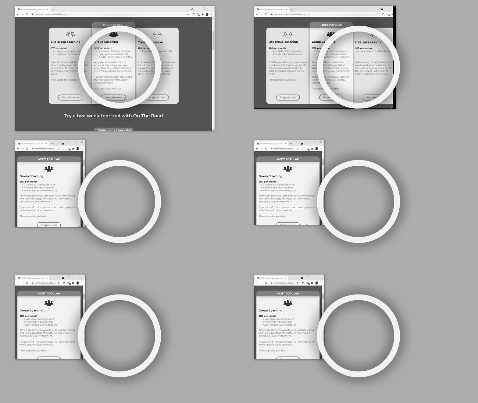
I used webflow’s responsive design features to easily transition from tables to cards when comparing coaching services across desktop and mobile devices.

otr_website_home.jpg