MFK Design
MFK Design
Michael Ferguson-Kang - UX designer


Access Canberra is intended to be the front door to government services at both a local and state level for residents of the ACT. As one of the ACT’s most visited government websites, it extends itself over 2700 pages of content, across more than 450 services.

By educating Access Canberra on the needs of it’s users, we were able to focus down their content into a intuitive and user friendly state.

  • Applied skillsets: UX Designer | UX research

  • Tools utilised : Figma | Miro | Dovetail | Adobe Photoshop | Adobe InDesign | Maze.co | Optimal Workshop

The work for Access Canberra was completed in two phases:

Access Canberra User Research

Access Canberra Information Architecture


User Research

Background

With a decision to re-invent the Access Canberra website, my team was tasked with conducting user research and re-design of the information architecture.

Key Objectives

  • Provide discovery to support the future development of the Access Canberra

  • Educate Access Canberra product owners to understand the needs of their users

  • Design Access Canberra a framework that provides:

    • A Better experience

    • An increase in user uptake

    • An increase of repeat usage

Learning goals to achieve objectives

  • Understand who uses the Access Canberra website

  • Understand what are they trying to achieve​ on the Access Canberra website

  • Explore the end-to-end user experience

  • Identify workflows that worked well

  • Identify pain points and barriers

  • Identify and understand what users interact with the most

  • Identify and understand what users interact with the least

  • Identify areas that don’t align with current UX and accessibility guidelines

  • Identify and understand what channels users use to interact with Access Canberra (website, call centre, service centre etc.)

Discovery methodology

  • Internal stakeholder interviews with over 8 groups covering 56 participants

  • Desktop research based on best UX and accessibility practices & Google analytics

  • In-depth interviews across 51 participants representing a cross-section of ACT residents and businesses

  • Online survey collecting responses from over 255 participants

  • In-depth interviews were run across 

    • 37 Access Canberra residents.

    • 9 Access Canberra Business users

    • 5 users who had never used Access Canberra before


Resident users needs

Most participants could identify a variety of reason for visiting Access Canberra. A typical participant named up to 5 tasks that had required them to interact with Access Canberra.

Four tasks were the most common reason for an personal user to visit the website:​

  • Renew or transfer a vehicle registration – 77%

  • Renew a driver’s licence – 57%

  • Apply / renew a Working With Vulnerable People card (WWVP) – 38%

  • Pay a rates bill – 29%

Other reasons were:​

  • Access information on suburbs – 26%

  • Report a street issue – 26%

  • Pay a fine or penalty, including payment plan – 22%

  • Access information on service centre / call centre – 20%

Why people come to Access Canberra

ACT residents were very familiar with Access Canberra, seeing 1.6 million users in the last 12 months. The usage was so high, that we were required recruit “non Access Canberra users” from interstate applicants so that we could better understand how new users experience the website.

  • A users perception of Access Canberra was usually limited to the functions they commonly used.

    • Knowledge of other functions outside of their own needs was rarely mentioned.

  • There were varying reasons behind having a first interaction with Access Canberra:

    • Almost all participants who had moved to the ACT had arrived at Access Canberra when transferring registration and licenses.

    • Some users mentioned being referred from it’s predecessor, Canberra Connect.

    • Users who were task-orientated generally arrived from Google search results.

  • Almost half of the participants described it as one of a number of government websites they use.

  • A quarter of participants described it as their ‘go-to’ government website.

  • Others visited only when they had to or there was no better option.

Outcome

Our recommendation was that:

  • Access Canberra should carry on highlighting popular transactions on the home page.

  • Design the website in a way the prioritises a user easily finding and completing their tasks.

  • Prioritise the design of the most popular transactions so users can compete them easily and intuitively.


Business users needs

Business users had some distinct needs:

  • Business participants visited the Access Canberra website more frequently than personal users.

  • Almost half the business participants visited the website daily or weekly.

  • The majority of business users felt that the homepage was not applicable to them or their business.

The most common reason for business users to visit the Access Canberra website were to: 

  • Renew or transfer a vehicle registration (business use) – 47%

  • Access information on service centres – 40%

  • Access information on guidelines and regulations – 36%

  • Register a business / apply for, renew, or cancel a licence – 27%

Outcome

Business users came with the same recommendations as the personal users, however their tasks should be separated on to a different section of the website.

  • A business hub that would quickly navigate to:

    • Information for businesses

    • Transactions for businesses


Do users view Access Canberra as the Government’s ‘one stop shop’?

One of the questions asked to participants was:

Access Canberra is currently intended to be the place you go for any transaction with Government. Does that make sense to you? This would mean anything from renewing drivers' licences to applications for entry into public schools.

  • Most participants agreed with the principle of a one-stop shop, however one user caveated that they may have agreed because of all the advertising Access Canberra released.

  • Participants believed that Access Canberra should be limited in it’s scope:

    • Many participants felt Access Canberra should be limited to transactions and payments.

    • Large services, such as education or health should live on the respective government websites.

    • Education was commonly given as an example where users would go straight to the ACT education website and would not think to go via Access Canberra.

Outcome

Our recommendation was to:

  • Keep the positioning of Access Canberra as the ‘one stop shop’ for transactions and simple tasks.

  • Keep complex services (such as education, health, or business-related) housed primarily on their own respective department websites.


How users arrive at Access Canberra

Google analytics showed that the majority of user traffic to the Access Canberra website comes from search engines.

  • Some participants stated they would Google Access Canberra, others searched based on their particular task.

  • Some participants said they may be more inclined to use Google if the task was one they hadn’t performed before.

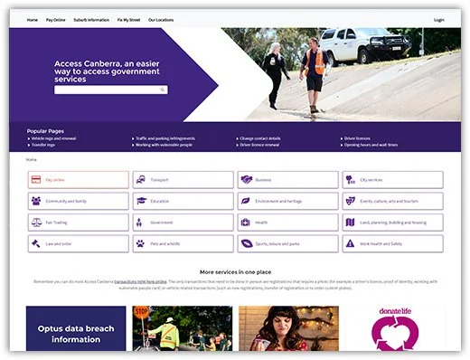
The homepage was where 25% of users started their journey. Which came with the following feedback:

  • The website featured two search bars with in relatively close proximity of each other. This caused confusion for the participants.

  • Popular pages links was received positively however they failed to give the full picture of services available.

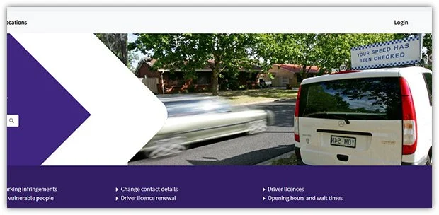
  • Some of the imaging created negative feelings with participants, particularly around imagery of speed cameras.


Use of imagery that reminded users of fines and infringements created a negative feeling at the start of a users journey.

Outcome

Our recommendations were:

  • That they ensure SEO optimisation is maintained.

  • To redesign the homepage to support intuitive and timely navigation.


Device preferences

Device preference was often driven by whether a user was at work, home or a different setting.

Preference was partly driven by the design of the website. Pages with large amounts of content pushed some users on to devices with a larger screen out of necessity.

Specific tasks that were perceived as easier with a larger screen were:

  • Navigation

  • Completing forms

  • Attaching documents

  • Complex tasks that were considered slow to complete.

Outcome

We recommended that they look at improving their mobile experience to allow users to use the device that suits them.


Usability of Access Canberra

The majority of participants rated their most recent experience with Access Canberra as good to very good.

  • Customers most recent interaction tended to drive their experience rating

  • Most customers came for simple tasks such as vehicle registration

Participants who rated their experience with Access Canberra negatively tended to have been through more complex tasks. A prime example was the application for a Working With Vulnerable People certificate which almost universally saw a negative experience.

During testing we had participants run through two tasks we classed as complex:

  • Make a complaint about a noisy party

  • Find out information on their consumer rights

Participants struggled in multiple areas:

  • Navigation

  • Search results

  • Page layouts

  • Links buried in layers of copy

  • The use of legislative copy outside accessible reading levels

  • Forms that then linked to other forms requiring information to be entered twice

  • Not knowing where they were on the Access Canberra website

Outcome

Our recommendations were:

  • Redesign the focus of the website to user tasks, away from forms and content.

  • Prioritise and simplify tasks to provide a streamlined user experience.


Search function friction

Almost all participants experienced issues around the search function.

With the presentation of two search boxes on the home page, users were understandably confused.

  • What was the difference?

  • Did they search different sections on the website?

  • Why weren't the differences listed?

When users did search:

  • The highest rating results presented to users quite often were not relevant to the search.

  • Relevant results often ended up being up to 5 pages deep.

  • In some cases, their search yielded no results at all.

The auto-complete function confused users because:

  • The design pattern used went against established websites such as Google

  • Some users also felt they had to use one of the auto-complete options, not realising they could hit ‘enter’ or click on the search icon to be taken to a comprehensive search results page.

Outcome

We recommended Access Canberra:

  • Diagnose and resolve the issues with the search function results.

  • Match established design patterns for the search function.

  • Limit the homepage to only one search box.


Navigation was a disjointed experience

Access Canberra had been designed with the principle that there were “No wrong doors”. However, what this resulted in were user being frustrated by a very disjointed experience.

  • We didn’t observe any users using the global navigation menu to navigate their way through the website. 

  • Participants were found to take a best guess approach to navigation, hoping that the next page held the content they needed.

  • Users often found themselves frustrated by clicking through multiple levels of navigation:

    • This quite often lead to multiple pages being navigated through and back again as they didn’t find the information they needed under that particular subject heading.

  • Many breadcrumbs at the top of pages did not line up with the journey that a user had taken.

  • At other points in the website the sub-navigation menus would appear on the left hand side of pages, changing the design pattern of the predeceasing pages leading to confusion and frustration.

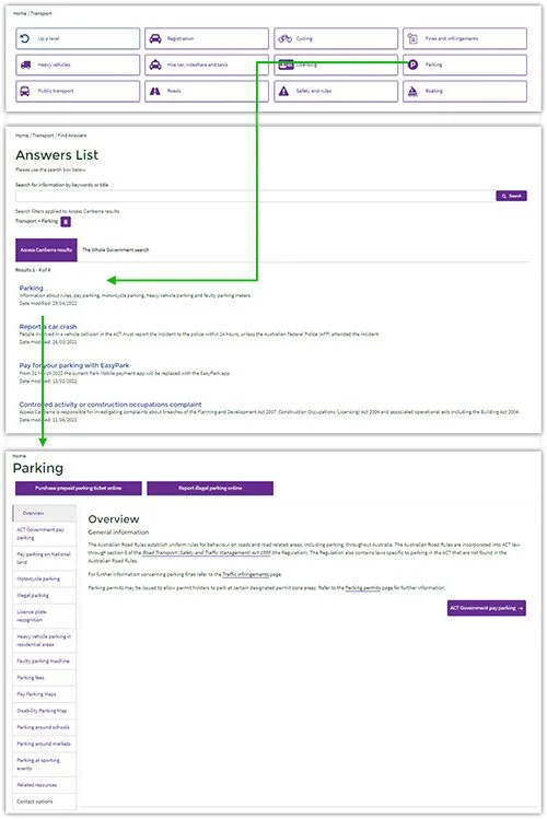
  • Some pages went from pages designed with the Access Canberra design system to a search results page from a prefilled entry. This created a jarring and confusing experience for users as they tried to understand how they got there.


An example of a users disjointed journey from a menu item, to a pre-filled search result to a new page with a completely different layout.


A lack of visual heirachy lead to:

  • Many participants missing the CTA buttons at the top of the page.

  • Links embedded in content being easily missed when scanning pages.

  • Some pages had up to 3 alerts in a row. Alerts took up so much room they went below the fold and lost all emphasis.

Outcomes

Our recommendations were to:

  • Re-design the information architecture

  • Maintain a consistent layout

  • Be consistent with the use of tiles and dot points to aid scanning

A “No wrong door” design principle left Access Canberra users without a clearly defined path

CURATOR.IO (Copy) (Copy) (Copy)

Deliverables

Out of discovery, we produced a detailed report for Access Canberra giving them a better understanding of their users needs and issues and applicable recommendations of how to improve their current state.

I supplemented this report with the design of 5 artefacts:

  • 2 x Personal user customer journey maps

  • 2 x Business user customer journey maps

  • 1 x User needs matrix

In which I was able to highlight:

  • Pain points

  • Emotional state

  • Page click throughs

  • Thoughts

  • Opportunities

  • Similarities between personas


Information Architecture

Redesigning the IA

After completing the User Research report, our team was awarded the contract for the re-design of the Information Architecture.

From our research we knew that Access Canberra trying to be all things to all people, left its users with a clunky and overwhelming experience.

Our hypothesis was that a simplified IA with the most common tasks would faster connect users to the transactions and information they need.

Our success indicators were:

  • The expectations and goals align to a users experience.

  • If users fed back an improvement in experience compared to the current state

  • People expressed positive sentiments about overall Access Canberra interactions

Our key goals were:

  • Users can intuitively and quickly navigate to the information and complete transactions they need

  • Bring the Access Canberra website back into line with the best practices of Government Websites

  • Refer people to the authoritative websites rather than creating competing or contradictory information with duplicate pages

  • Making sure users understand the purpose of Access Canberra

Challenges

  • Access Canberra used a CRM so a sitemap was not available

  • Access Canberra housed over 2700 pages covering 450 services


Approach

Scope of work

With so many pages to cover we needed to find a way to manage a complete IA re-design in an 8 week period.

We knew that:

  • 170 pages and 10 topics accounted for more than 50 percent of Access Canberra traffic.

  • The content audit of Access Canberra showed that there were a lot of broken, duplicate and outdated pages.

To bring the work into a manageable size we filtered down our scope of work to pages with over 1000 views in the last 12 months.

  • Access Canberra would be responsible for sorting through the culled pages.

  • Any pages that needed to remain could be re-integrated using IA guidelines we provided.

Design Principles

User research informed us that users viewed Access Canberra as a shopfront to:

  • Gain information

  • Pay for services.

  • Register for services.

Separate the IA:

  • Users didn’t expect business and personal content in the same place.

Utilise a job to be done framework:

  • Doing so allowed us to prioritise the tasks defined as essential and most popular.

Don’t duplicate content. Where possible hand over to authoritative websites, e.g. Health and Education:

  • Duplicated content created confusion for users.

  • Duplicated content required maintenance to keep it up to date.

Refining the services

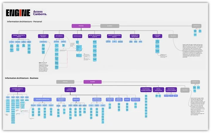
From the services we analysed across both personal and business users, we found the following to be essential to remain on Access Canberra:

Personal

  • Motor vehicles

    • Licenses,

    • Registration

    • Traffic and parking infringements

  • Births, relationships, deaths

  • Report an issue

  • Building and property

  • City Services

  • Identity & verification services

  • Community and recreation

  • Consumer rights 

Business

  • Business advice & support

  • Industry licenses and registration

  • Mutual recognition

  • Associations, co-ops & charities

  • Occupational business registers

Removed and re-linked with handover pages to the authoritative websites

  • Planning

  • Health

  • Education

  • Community Services

  • WorkSafe

  • Events

  • Fair trading


Testing the Pay Online page

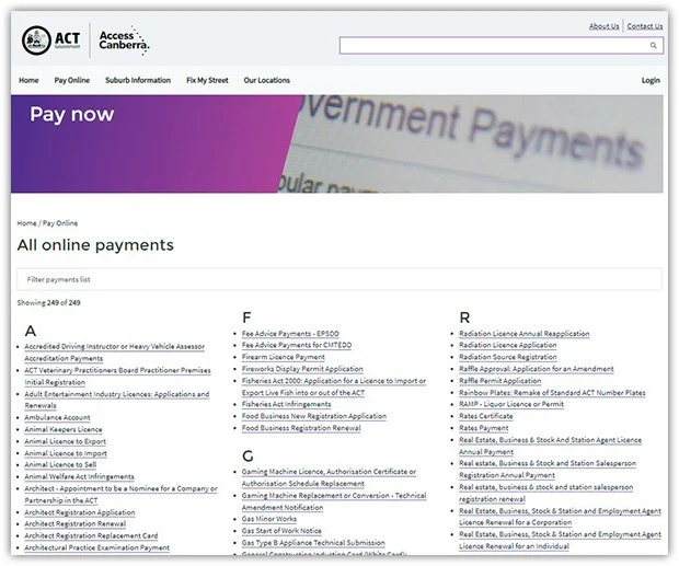
The Pay Online page provided a unique challenge. There were suggestions from some stakeholders to remove the page while some wanted to see it kept.

The argument to hold on to it was a good one, it was the 8th most visited page. However, that didn’t paint a complete picture

The Pay Online page linked to forms that were hosted on a different websites and as such, we couldn’t track complete user journeys.

As such we didn’t know:

  • If users found the form they needed

  • If users completed a transaction

  • If a user just closed the page and left

  • How many users were Access Canberra staff trying to assist a member of the public

Furthermore, the Pay Online page included every possible task that ended in a payment transaction. While these tasks do end in a payment, the nature of the task (for example “Certificate of Electrical Safety”) were not typically associated with a payment. I conducted an audit on the Pay Online page to establish how many forms explicitly mentioned payment. Of the 102 forms I reviewed:

  • 33 were actually payment pages

  • The remaining were applications, submissions and registrations that simply ended with payment as a final step

  • The page suffered heavily from legislative speak with forms labelled in jargon

Testing results

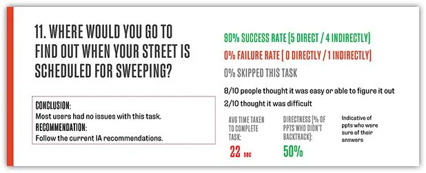
We gave users scenarios and ran users through first click testing:

From the home page:

  • Tasks such as pay a fine or bill would saw 90% of users navigate to the pay online page

  • Tasks such as applying for a birth certificate saw all users (100%) navigate to the relevant subject pages.

On the Pay Online page we ran tests against legislative labelling, progressively picking forms where the labels increased in reading levels.

  • Applications for a new marriage certificate saw a 100% success rate.

  • Application to remove a dying tree labelled as “Nature Conservation Act 2014” saw a 0% success rate.

Outcome

We recommended that Access Canberra:

  • Limit the Pay Online page to payment tasks to match the users expectations and reduce cognitive load by reducing the overwhelming amount of forms. 

  • Form labels need to be re-written in plain language to be intuitive and match accessibility standards. 

  • Label forms with a brief description underneath to help users understand when to use the form. 

  • Group forms by categories, not alphabetically to provide users with better context.


User testing

Our first draft Information Architecture was developed using the guidlines and design principles above.

We utilised hybrid card sorting to test the 170 pages.

  • Users were asked to sort the subject cards in to categories

  • We provided users with pre-defined categories from our IA draft

  • Users were allowed to create their own categories if they felt there wasn’t one that matched a card

Outcome

Business results

  • Only one category was created from 1 user for a single card

  • Pawnbrokers was re-labeled to 2nd hand goods and traders

    • This allowed us to remove a category by combining it with 2nd hand industries

  • Surveyors registration was recommended to be cross linked with construction

Personal results

  • Users struggled to differentiate types of transport (private vehicle vs public services) which lead to the re-labelling of “Public transport”

  • Cards revolving around private vehicles were renamed to the task . Eg Vehicle Registration

  • Land rates and taxes were combined in to a single category

  • We recommended that Civil Union and Civil partnerships labels be reviewed as 20 percent of users didn’t understand the subject


Round 2 testing

With the feedback driving the next revision, we utilised tree jack testing to evaluate the findability and structure of the proposed IA.

Users were given scenarios and presented with interactive categories to navigate to and find.

Outcome

Business results

  • We found users looked for keywords such as “licence” from the task in the IA. This was changed back to the industry standard of “Mutual recognition & Business registers”.

  • We also found that success rate of users tended to test better with those whose industry matched the task. Our recommendation was to push live what we had designed, and to re-test with specific industry subsets once metric tracking could be implemented.

Personal results

  • Testing our IA on this user group received an 80% or higher success rate on all but two tasks.

  • One task which didn’t test well at only 50% success was around the MyWay card. The MyWay card is the ACT public transport card. We attributed the poorer results due to the lack of ACT residents.

  • The task “Where would you go to make a complaint about a business or service?” Saw most user navigating to the right category but missing the label of fair trading. We recommended that the content designer re-address the labelling once they had completed re-designing the content.


Delivered product

Our final IA was presented and accepted by the client with the following outcomes:

  • Complete redesign of the IA with a successful separation of Personal and Business subjects allowing users to easily and intuitively complete their tasks.

  • Auditing and removing duplicated content found on other government services websites. This greatly reduced the amount of content requiring re-writing and maintenance while avoiding confusion over which authority the subject came under.

  • Re-organising content under a Jobs To Be Done framework allowing users to faster complete the task they came for and avoiding unnecessary time scanning pages of content looking for a CTA to the right.

  • Providing guidelines for integrating new content and services into the IA to maintain an intuitive navigation experience.

  • Providing guidelines to the Pay Online page to match users expectations while reducing the cognitive load taken for a user to find and complete their task.