The client
Curator.io approached us with a pretty intense goal; help them to reduce their churn rate (the loss of clients) from 4% down to 1%.
Curator is a social media aggregator that helps you collate and display any social media feed. It pulls selected posts across multiple social media accounts to display them in a single, customisable and embeddable-anywhere feed.
When we talked to them they were in the process of implementing a new on-boarding process. They also suspected there were some usability issues with the user interface and we were asked to take a look into that.
The research
We initially started out research by familiarising ourselves with Curator.io and conducting competitor analysis. We then sought to understand how users were interacting with the curator interface in its current state. To do this we used observational usability testing.
All testing occurred while social distancing measures were in place, so our sessions were conducted over Zoom with users sharing their screen.
A (very) rough heuristic overview on the curator.io interface based of off the issues that the users were facing.
Research insights
Our testing highlighted numerous challenges that users faced when trying to interact with the platform:
The UI lacks direction. There is no actual button to "finish" the current step which will take you to the next one.
It’s easy to get lost in the platform and not be able to find your way back.
The sheer amount of options, not in a intuitive order is overwhelming.
The platform lacks feedback when interacting, or in other cases the feedback isn't obvious enough. A slightly different shade of grey does not provide enough emphasis to note a change.
Ultimately this isn't an easy platform to just jump in and get started. You need to learn how to use it which takes a time investment.
People need to learn new, complicated terms.
The use of icons with inconsistent hover over hints makes it feel like roulette as to what might happen.
The grey theme is visually appealing. However, there is very little visual emphasis to direct a user with what they should start interacting with.
Problem Statement
Users struggle to instantly pick up and start using curator due to an overwhelming and unintuitive interface
Minimum viable product
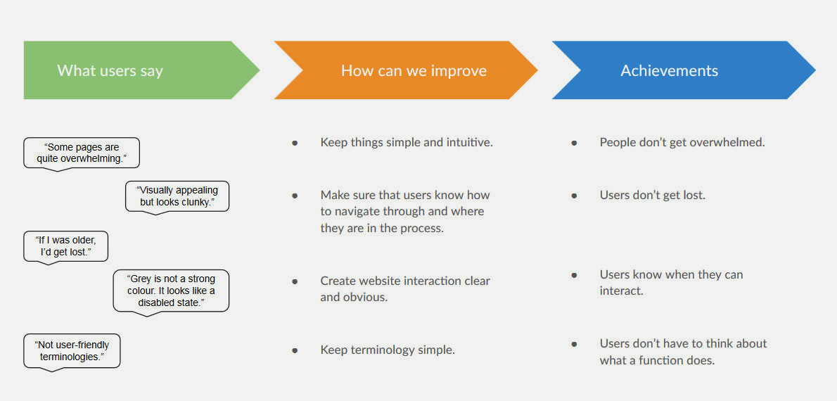
After the first team discussion we realised we could roll 3 fixes into one. Though it was the highest effort, fixing the issue of layout and format would provide the most value to end users.
By addressing the layout and format we could also correct the issues based around the colour palette, while also addressing the difficulties users had with the technical terminology.
Our design objectives.
If we could hit these targets we would create a more usable design
Concepts
The biggest change we looked to make with Curator.io was to break the overly complicated 4 + pages into one simple UI which a user could access all the functionality from.
The team broke off for a prototyping brain storming session, with each team member coming back with their version of what the simplified UI could look like.
Curator io simplified down to one interface.
A high fidelity prototype I created based around the research findings and our early user testing.
For a direct link to the video you can click here.
The UI has been consolidated down to one interface where everything is accessible from. Website call to actions are now clear and obvious. Confusing industry jargon has been removed.
The prototype
The first prototype was a proof of concept to see how users would react to simplifying curator.io interface down to one UI. With a few bits taken from everyone's concepts we put together our test UI.
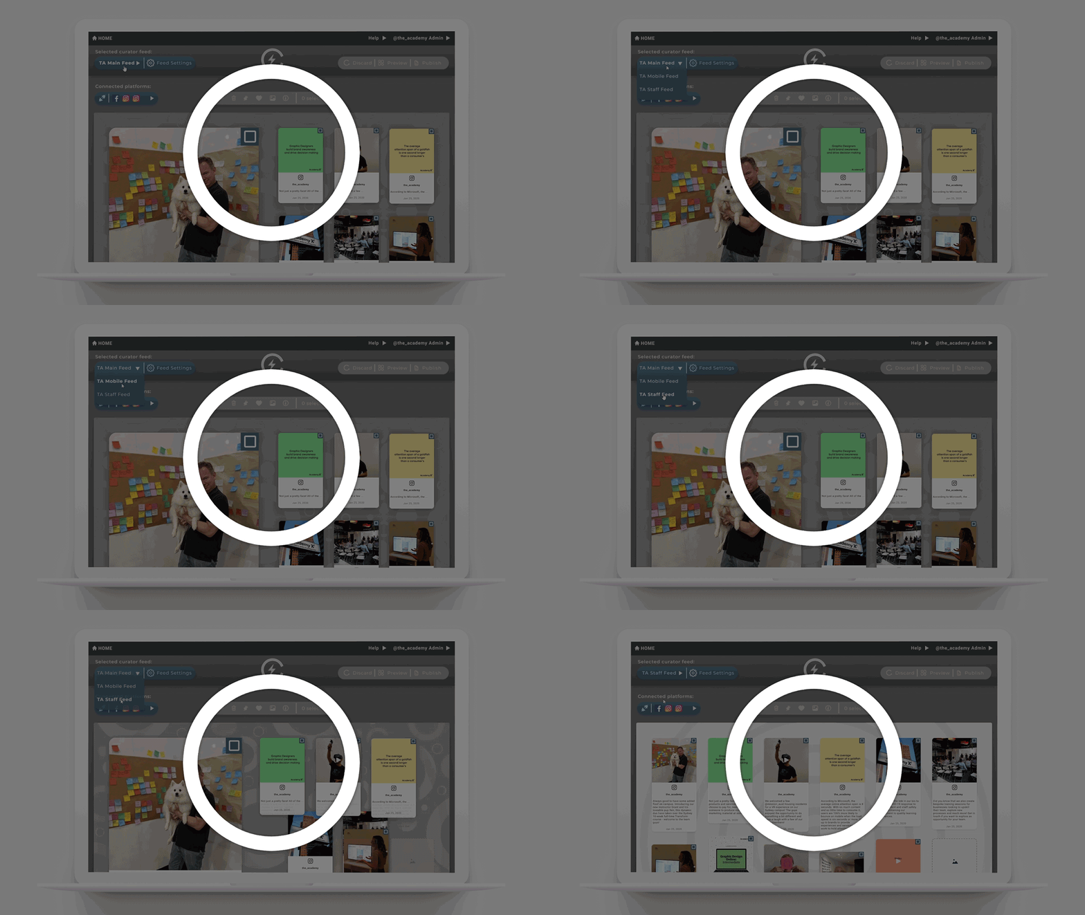
In the top left we can see the feed options where a user can change which of their feeds they are working on. From this menu a user can then navigate to the settings for the post rules and custom design settings.
In the main work area a user can filter through connected social media platforms as well as curate the posts that have been collected from those platforms.
In the top right hand corner we have the share, preview and publish pages easily accessible for a user.
From this a user can access all the frequently used tools from the one interface.
Feedback
The results were extremely positive. Users were able to easily navigate through tasks and no longer felt lost in the process. With the technical terminology removed, the cognitive burden on the user was reduced.
We conducted usability testing on this prototype through Zoom. Our objective was to see if we had made the UI more intuitive with a series of tasks for users to complete.
We did however come across two issues that I have addressed in my hi-fidelity prototype. The first issue was confusion between a user's curator feed which they would embed on the website, and the feeds from the social media platforms that had connected to their account.
The second one was the use of icons: If there was a chance for an icon to be misinterpreted it would happen. This was very evident when accessing the feed settings.
Presenting to the client
Initially we were dealing with one point of contact who was very keen to make changes at Curator.io. We had multiple stand-ups with the client throughout the project on top of the initial kick off meeting, and a mid project show and tell.
When I conducted the final presentation we were surprised by the CEO/Founder being present. Unfortunately, coming in at the back-end of the project he was missing some context, and was also understandably protective of what he had created.
There were a few cases which he argued hard against what we presented; however I was able to make valid arguments using the research data from the initial usability and prototype testing to allow him to empathise with users.
This particular experience was extremely valuable and reinforced to me why I need to continuously champion the needs of the end user.
Curator.io was originally built around technical features and functionality and did not consider the end user. I was able to demonstrate to this stakeholder that users did not understand how to interact with this overly technical product, and was in need of a more simplified design to address the churn rate.
Curator.io informed us that they would be pushing our changes live within a month or two and will pass on how it performs so watch this space!
Other projects
EnergX
This project helped to find a gap in the current services offered by EnergX that its users wanted the most.
Bites Co
This project helped Bites Co to understand the true value that they bring to their B2B customers.
3D Design
A collection showing some of my work for Toyota.