User portals
Why we built user portals
BetStop didn’t stop at self-exclusion. There were multiple reasons why a user may need to come back and interact with the platform. I was responsible for designing two user portals.
The self-excluded user portal allowed:
Users self-excluding again
Users extending their self-exclusion period
Users looking to update their details
Users looking for support options
Users updating account preferences
The Nominated support person user portal allowed:
View, manage, contact and support people thorugh self-exclusion
Support multiple people through self-exclusion
Self-excluded user portal
User needs
Users need to be able to easily and intuitively make changes or updates to their account
Different options needed to be presented depending on a users state of self-exclusion
Users needed to be able to conduct their tasks safely, without content being presented to them that could trigger damaging thoughts or urges
Design - Desktop
Users were most likely to come to the portal with a single task to complete. We presented all options available to their state of self-exclusion. To reduce the cognitive load the portal was designed with:
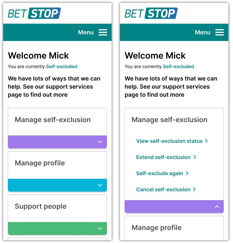
Listed menus under clearly defined categories to aid scanning
Created visual separation by placing the categories in boxes with highlights from the colour palette
Design - Mobile
With less screen real estate available the design used the available highlights of the desktop design to create expandable accordions.
Warning notifications
Warning notifications were triggered when:
Users whose self-exclusion was due to expire in 14 days or less
Users who had applied to cancel their self-exclusion and were waiting for the 7 day cooling off period
By utilising warning UI elements, we could draw attention to the time constraint and offer alternative actions that the user could take.
Testing results
6/9 users found that the portal layout was clear and easy.
3 users felt that there were too many options at once, with one user asking for a bigger differentiation in font sizes between the menu items and the headings
Some participants felt that the order of menus should be changed.
Changes from testing
I implemented a stronger use of whitespace to reduce visual noise within the UI.
I re-ordered the categories to place manage self-exclusion before the manage profile options.
Nominated Support Person (NSP) portal
User needs
View contact information of supported persons
Remaining periods of self-exclusion
Status changes to supported persons
View multiple supported persons
Design
I provided the view of all people an NSP was supporting from one screen. The order of users was defined by:
New nominations + a warning alert that informed the user that they were awaiting a response
Users whose circumstances had changed + a warning alert that action may be required
Users who were currently self-excluded
Users whose self-exclusion had expired + a inverted colour scheme to show these users as inactive
Users who had removed them as NSP’s + a inverted colour scheme to show these users as inactive
This allowed us to provide NSP’s with time sensitive information first while the progressively listing off users whose circumstances for support may not be as pressing.


